The new expansion/update/patch has come out and the new graphics are in. Those changes are noticeable on login and do vastly improve the game.
Seeing the new systems that the console ports spawned is now giving back to the PC version. I've liked almost everything I've see so far. One downside is the blinding brightness of some effects, but that is a 'known problem'. Overall everything is a lot more detailed and looking at the game now it seems to have a greater depth and that's for the better.
The changes are large and small. Some of the small changes include some cleaner icon or markers in the UI that vastly improve the look and feel. Seeing the game and the changes have totally put my mind at ease as I was concerned with some of the before and after images that were shown previously.
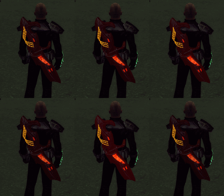
It really is a great overall update. Like the image below. My main weapon never glowed overall like that, nor did I ever notice the three tubes glow and pulse like they do now. Granted the image was taken in a cave and it was dark but still that's a big change from something that never looked that noticeable before.
The other big changes I like are to do with the Kit's & Kit modules. Kits now only give passive skill increases. Much needed as they are a lot more versatile (imho) now.
Another very welcome addition was the 12 extra bag slots given for free to all characters!
I've only scratched the surface of changes and I look forward to seeing more on how the game has been improved.


No comments:
Post a Comment